Letter Size Consistency Rules for Neat Handwriting


Founder, Younglabs — partner across your child's learning journey
Engineering gold medallist · ISB Postgraduate · Building Younglabs across Foundations, Academic Excellence, University & Beyond
30 May 2026 · 8 min read
_____________Education
Two ways to fix this at home this week
Letter and word pages, sorted by age.
Book a free handwriting class (ages 5–13) →Most parents have experienced this moment. They open a notebook, glance at a page for barely two seconds, and instantly feel that something looks either neat or messy. Interestingly, this reaction usually happens before they have actually read what the child has written. The content could be correct, the spelling could be accurate, and the ideas could be perfectly expressed, yet the page may still feel difficult to look at. On the other hand, another page might immediately appear organized, balanced, and pleasant even before anyone reads the first sentence.
What creates that difference is often not handwriting style, beautiful handwriting, or fancy letter formation. In many cases, the biggest factor is letter size consistency. When letters maintain a predictable height and proportion throughout a paragraph, the brain processes the writing more easily. When sizes constantly change, reading becomes harder because the eyes must continuously adjust to visual irregularities. This is why children can sometimes write every letter correctly yet still produce handwriting that appears untidy or difficult to follow.
Many parents focus heavily on pencil grip, writing speed, or cursive handwriting practice, which are certainly important. However, letter size consistency quietly influences almost every aspect of handwriting clarity. Without it, even well-formed letters can make a page look disorganized.
The Hidden Reason Letter Size Matters More Than Parents Realize
Want a page to practise on?
Letter and word pages, sorted by age.
Book a free handwriting class (ages 5–13) →Children rarely wake up one day and suddenly start writing letters of different sizes intentionally. Usually, inconsistent sizing develops because several handwriting skills are still maturing together. Hand control, visual judgment, spacing awareness, posture, finger strength, and movement planning all influence how consistently children size their letters.
Think about a child writing a simple sentence. While adults automatically maintain similar letter heights, children are simultaneously trying to remember spelling, think about ideas, hold the pencil correctly, manage pressure, stay within lines, and write at classroom speed. With so many things happening at once, letter size often becomes one of the first skills to lose consistency.
Parents often notice patterns like these:
- The first few words look neat, but letter sizes gradually become larger across the page as hand control decreases.
- Some letters suddenly appear oversized while nearby letters become extremely small, creating uneven visual flow throughout the sentence.
- Capital letters and lowercase letters begin looking similar because height differences are not maintained consistently.
- Writing inside ruled notebooks appears acceptable, but once children move to plain paper, size control becomes noticeably weaker.
- Letter sizes become more inconsistent whenever writing speed increases or longer assignments are introduced.
These patterns are not signs of laziness. They usually indicate that the child's motor control and visual planning systems are still developing and need structured practice.
Neat Handwriting Is Actually About Visual Rhythm
One misconception many people have is that neat handwriting is primarily about drawing attractive letters. In reality, neat handwriting functions more like visual rhythm. When letters follow predictable patterns of size, spacing, alignment, and proportion, reading becomes effortless. The eyes move smoothly across the page without interruption.
Imagine reading a paragraph where some words are tiny, others suddenly become large, and certain letters stretch far above or below the writing line. Even if every letter is technically correct, the reading experience becomes slower and more tiring. The same thing happens to teachers evaluating notebooks. They are not consciously measuring every letter, but their brain automatically responds to visual consistency.
This is one reason why handwriting clarity affects school performance more than many families expect. Children with inconsistent letter sizing often need more time to complete written tasks because they frequently correct mistakes, rewrite words, or lose writing rhythm. Over time, this can influence writing confidence, paragraph writing quality, and overall presentation.
Interestingly, many handwriting improvement specialists focus on size control before introducing advanced handwriting styles. Whether children eventually learn print handwriting, cursive handwriting, or calligraphy handwriting, consistent sizing creates the foundation upon which all other handwriting skills are built.
Common Situations Where Letter Size Consistency Breaks Down
Parents frequently observe size-related problems during everyday homework sessions without realizing what they are actually seeing. The issue often becomes visible in specific situations rather than throughout the entire page.
Some common examples include:
- During longer writing assignments, letter sizes gradually increase because hand fatigue affects movement control.
- When children become excited about an idea, writing speed increases and size consistency decreases.
- During tests, pressure and time constraints cause letters to become uneven and rushed.
- While copying from the board, attention shifts toward speed rather than letter formation accuracy.
- When writing unfamiliar words, cognitive effort increases and visual control over sizing temporarily weakens.
Understanding these situations helps parents identify patterns instead of assuming the problem exists all the time.
Practical Rules That Help Children Maintain Consistent Letter Sizes
Improvement rarely comes from repeatedly telling children to "write neatly." Most children already know they should write neatly. What they need are specific visual rules that make consistency easier to understand and practice.
Rule 1: Small Letters Need a Home
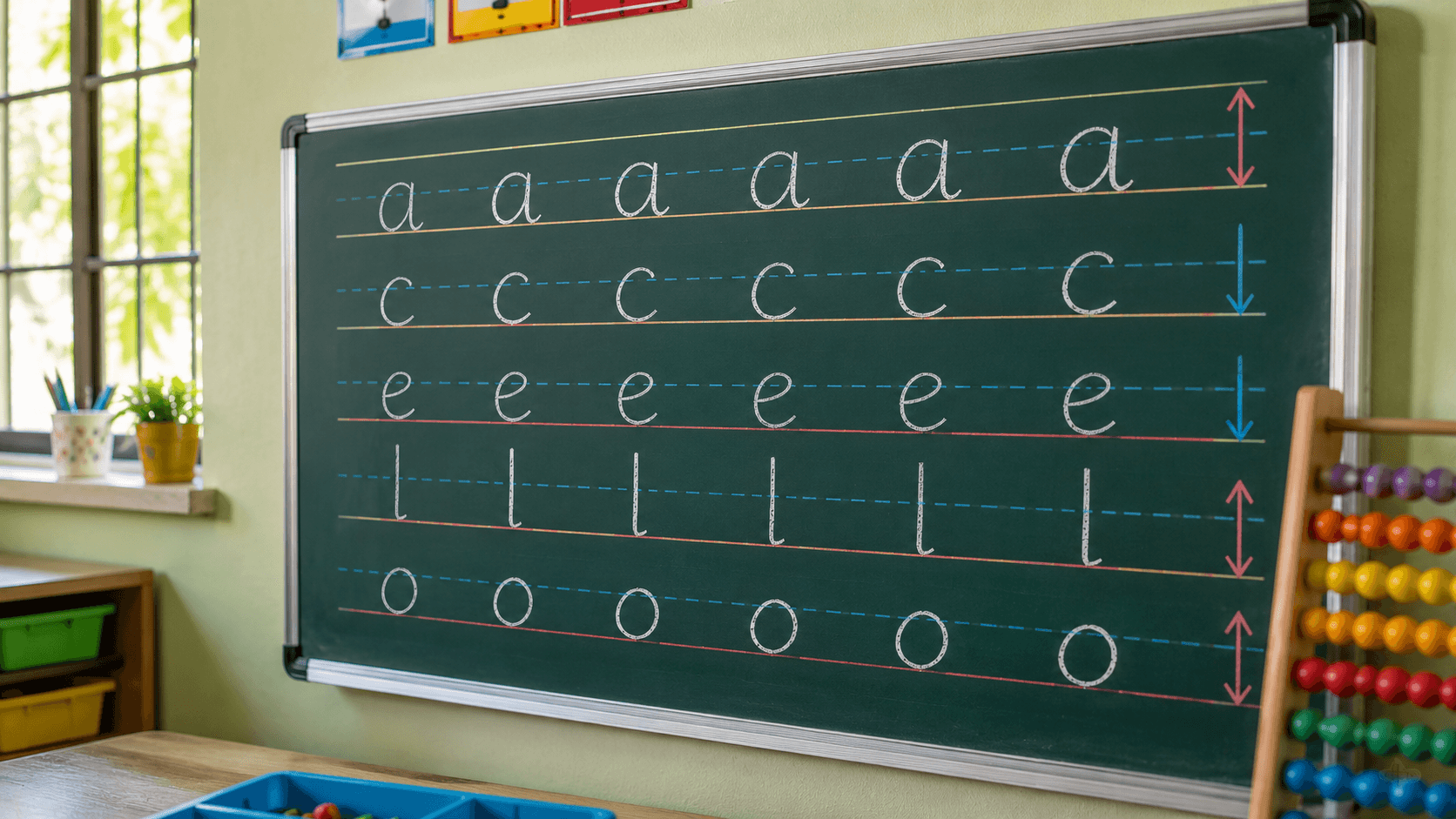
Many children benefit from imagining that lowercase letters live inside a fixed space. When letters such as a, c, e, m, n, o, and s consistently stay within the same height zone, writing immediately begins looking more organized. The goal is not perfection but developing awareness of visual boundaries.
Rule 2: Tall Letters Should Actually Look Tall
Letters such as b, d, h, k, l, and t need clear height differences compared to regular lowercase letters. When these differences disappear, handwriting often starts looking crowded and confusing. Children should learn to recognize that tall letters serve an important visual purpose by helping readers distinguish words more easily.
Rule 3: Capital Letters Need Consistency Too
A surprisingly common issue occurs when capital letters vary dramatically throughout a paragraph. Some become oversized while others barely differ from lowercase letters. Establishing a predictable capital letter size creates stronger visual balance across the page.
Rule 4: Focus on Whole Words, Not Individual Letters
Many children try so hard to perfect individual letters that they forget to monitor the appearance of the entire word. Encouraging them to glance back occasionally and compare letter heights often produces better results than constant correction.
Activities That Naturally Improve Letter Size Control
The best handwriting exercises do not always involve writing paragraphs repeatedly. Often, children improve faster when underlying movement skills receive attention.
A few highly effective activities include:
- Tracing patterns that require consistent movement heights, helping children build visual awareness before writing actual words.
- Using graph paper occasionally because the visible boxes create natural size boundaries and improve letter proportion awareness.
- Highlighting one row of correctly sized writing and asking children to compare future rows against that visual reference rather than correcting every mistake verbally.
- Practicing short handwriting exercises focused entirely on consistency instead of speed, spelling, or content quality.
- Combining fine motor activities with handwriting practice since stronger hand control often improves size regulation naturally over time.
Many parents are surprised by how quickly handwriting clarity improves once size consistency becomes the primary focus instead of general neatness.
When Inconsistent Letter Sizes May Need Extra Attention
Every child develops handwriting skills at a different pace, so occasional size inconsistency is completely normal. However, some signs suggest additional support may be beneficial.
Watch for patterns such as:
- Significant size differences appearing on almost every line despite regular practice.
- Difficulty maintaining consistent sizes even during short writing tasks.
- Frequent frustration, erasing, or avoidance of written work.
- Writing that becomes dramatically harder to read as assignments get longer.
- Ongoing struggles despite improvements in spelling, reading, and overall academic ability.
In these situations, targeted handwriting practice, structured handwriting worksheets, or online handwriting classes for kids can provide more focused guidance than general homework supervision alone.
The Bigger Goal Is Readability, Not Perfection
One mistake parents sometimes make is chasing perfect handwriting too early. Children do not need handwriting that looks like a printed font. They need handwriting that feels comfortable to produce and easy for others to read. There is an important difference between perfection and consistency.
A child can have a unique handwriting style and still write beautifully if letter sizes remain predictable. In fact, many adults with excellent handwriting have individual writing styles that differ significantly from one another. What they share is consistency. Their letters follow patterns. Their sizes remain stable. Their writing creates visual order.
That is ultimately the purpose of letter size consistency. It helps handwriting communicate clearly without forcing readers to work harder. Once children understand this principle, neat handwriting becomes much easier to achieve because they stop focusing only on individual letters and begin paying attention to the overall appearance of their writing.
Improving handwriting clarity is rarely about making children write more. It is usually about helping them notice the small habits that influence readability every day. When letter size consistency improves, handwriting often becomes neater, faster, and more comfortable naturally. A little focused practice today can make classroom writing feel significantly easier in the months ahead.
FAQs
1. Why does my child write some letters very large and others very small?
This usually happens because visual planning and hand control are still developing. Children are often concentrating on spelling, ideas, and pencil control simultaneously, which can affect size consistency.
2. Does letter size consistency affect school marks?
Indirectly, yes. Teachers generally find clear and organized handwriting easier to read. Better presentation can improve written communication and reduce misunderstandings during assessments.
3. What age should children start maintaining consistent letter sizes?
Most children gradually develop stronger size awareness between ages 7 and 10, although individual development varies. Consistency improves steadily with practice rather than appearing suddenly.
4. Can handwriting worksheets help improve letter size consistency?
Yes. Worksheets designed specifically for letter proportion and spacing often provide better results than simply writing long paragraphs repeatedly because they isolate the skill being developed.
5. Is cursive handwriting easier for maintaining letter size consistency?
For some children, yes. The connected flow of cursive handwriting can sometimes encourage more uniform sizing, although strong foundational print handwriting skills should usually come first.
Ready to improve this handwriting?
Letter and word pages, sorted by age.
Book a free handwriting class (ages 5–13) →